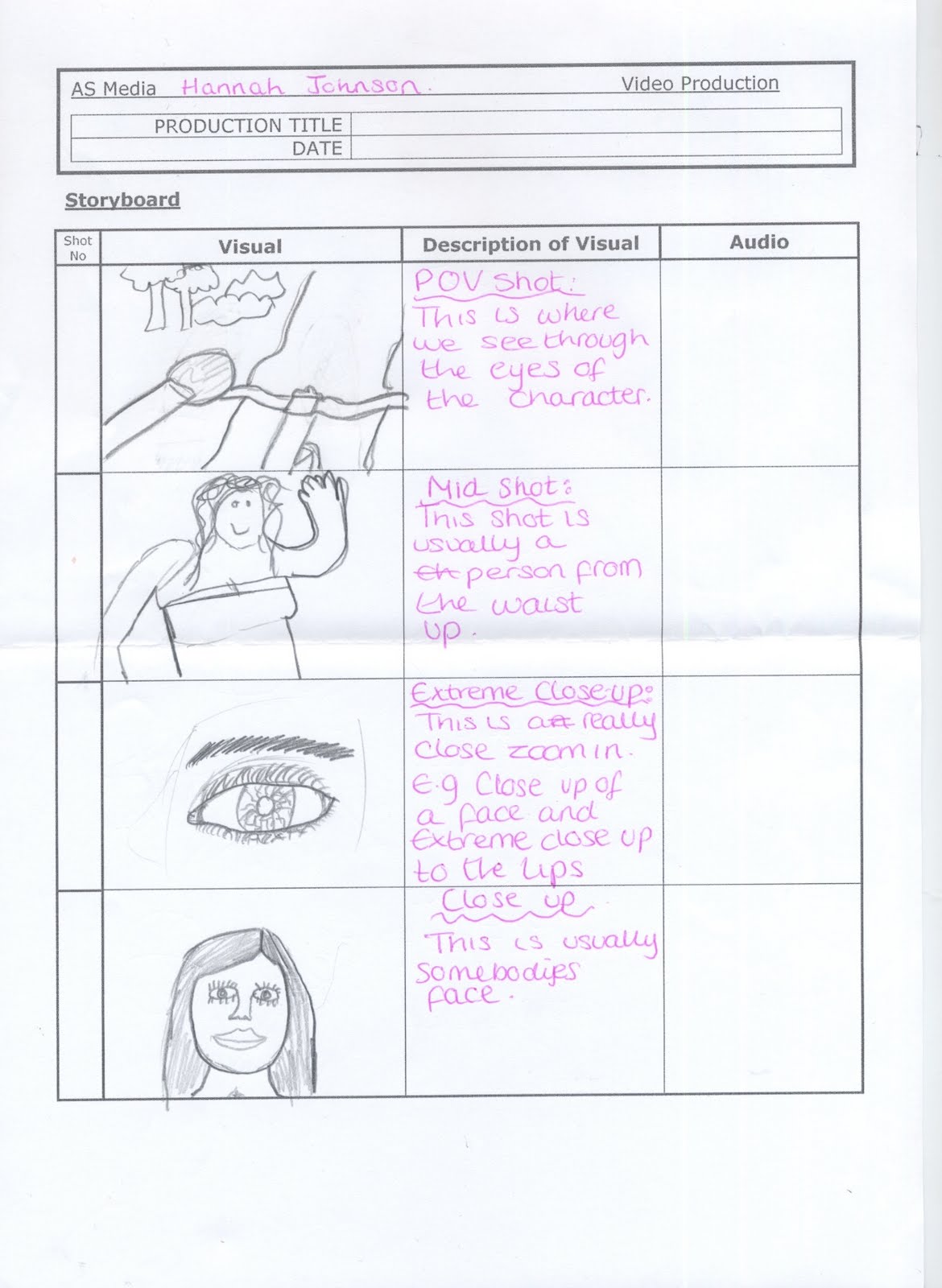
- POV shot (point of view) - Through the persons eyes
- Mid shot - A shot from the waist up
- Extreme close up shot - An extreme close-up on a face e.g the eye
- Close up shot - Usually somebodies face
- Two shot - Two people in shot
- Long shot - As shot of a person from head to toe
- Aerial Shot - A shot from above looking down
- Over the shoulder shot - A shot from over somebodies shoulder


Thursday, 30 September 2010
Reaserch and Planning: Shot type resarch
Using the internet and my own knowledge I have reasearched eight of the shot types and these are:

Tuesday, 28 September 2010
Research and planning: Premliminary task.
Evaluation of Front cover and Contents page for magazine
Front cover of my magazine.

What i like about my front page of college magazine:
- I like the font I have used for my Masthead and hook lines. I have used a freshman font that I found and I feel it connotates a college magazine as its very friendly and simple to read. Also from research it looks similar to other fonts used on college magazines.
- I also like the colour of the writing because it can apply to both boys and girls whereas if I had used all different types of pinks it would connotate that my target audience is the gender female. Also because the colours are bright and eye catching making people who see it want to read whats on it.
- The dominant image I have used on my magazine i really like because the image is of a happy student connotating to the readers that college is a fun place to be. Also because the person is smiling which also makes the reader feel welcome to read on.
- I like the strap at the bottom of the page which states the college logo because when somebody reads the front page of the magazine they will be drawn to this and they will feel they have picked the right college for their success as the superior word makes this thought "SHINE".
- I feel that the back ground could have more going on as becasue the image is put on to the background its doesn't look like a realistic place. Also because of the dull colour used people may connotate this as dull and then use this to associate it with college being dull. Then this would single out the intension of using a blackground to enhance the Masthead and the hooks lines. To improve this I could have got a picture of the outside of the college and used that as my background but made it opaque using the tool on photoshop to make the magazine more like a college magazine.
- I also feel that the layout of my magazine could be more professional and organised. I feel this because when I look at the front page I feel that it is all over ther place and messy. This would connotate to the target audience that the magazine is rushed and unprofessional. to improve this I could of made the the layout different for example move the image more to the left and have the hooks, and stores down the right hand side of the magazine.
- I feel I could of put more information about the "Issue" on the page to make people feel like there reading a really worthwhile magazine. To do this I could of used terms like "New Edition" or "Limited Edition".

What I like about my context page:
- On my content pages I like the fact that I have kept with the same colour scheme as the front page, as this is a professional thing to do. This connotates that I have taken time to make sure that my magazine follows a theme this tells the readers that the magazine is well presented and a lot of thought has gone into it.
- I also like the images used on the magazine as it makes the magazine less formal which I feel will make the target audience more comfortable reading the magazine. The pictures connotate that the magazine is laid back and friendly which connotates that the college is the same.
- I also like the issues my magazine bring as I feel this is what new students will need to know but on the other hand I feel there is also things new student will be interested to know.vfhgav
- On my context page I don' like the layout of the pictures and the paragraphs, I feel it makes the magazine look messy and untidy and that to me makes the magazine look rushed. To improve this I would look at more magazines and find which layout used on magazine contents pages looked the most presentable and neat for a college magazine.
- Also on my contents page I would change the back ground for the same reason as my front pages, because the target audience may associate the black background with dullness connotating that the college is a dull place to be. To improve this I would again use an image of the college and opaque it and use that as the background so its following the theme as the front pages if I were to change that to make the magazine look professional.
- To create my front page I used Photoshop. Using the tools on photoshop I managed to cut the dominant image so it was the only images used on the front pages. I managed to use a font that I thought followed the conventions of a college magazines.
- To create my contents page I used Indesign. Using indesign I was able to create columns to make my work look neater. I was able to create boxes in certain places to put text were it was wanted.
Yes my magazine does follow the conventions as it contains:
- Mast head
- Dominant image
- Hooks/ stories
- Tag line
- Issues
- Anchorage
- Strap (of information)
Wednesday, 22 September 2010
Research and Planning: Introduction to Photoshop (CD cover)

Research and Planning : Introduction to Photoshop (creating a document))

Research and Planning : Introduction to Photoshop (skin correction tutorial)

- The skin tutorial I found really easy and fun once I had got used to where all the tools that could be used were.
First I started by getting rid of spots and pimples on the face. To do this I selected the tool that looks like a plaster and pressed down onto it untill it had options. When the options came up i selected the rubber. This basically just rubbed out the pimples and spots when you pressed on them.
After doing this I decided to apply an eye liner effect to the eye. To this I used the paint brush and changed the thickness of the brush so it was finer. I then turned the opacity down by doing this I feel the eye liner looks more realistic.
Then I changed the eye colour, to this i used the paint brush also but changed the colour from black to a light blue. Then I made the brush thicker and steadily moved the brush around the pupil of the eye.
I then moved onto the mouth, using the paint brush I picked a peachy pink colour and coloured in the lips.
To remove the background of the picture, using the magic wand I selected the girl and then inverted the selection so it was the background and deleted and then change the colour to the pink colour seen.
finally I was going to put a glass effect on the lips to make them look glossy but I had ran out of time. But to do this I would of used the cut tool and drawn around the lips so they were selected from everything else on the face. Then by going to effects and picking glass this would have changed the lip texture.
This tutorial I found it the easiest and really fun and interesting to do.
Research and planning: introduction to indesign

- The first time on indesign i found quite straight foward and easy to use as the format is basically the same as Photoshop but you are restricted from some of the tools.
To create this review of Alice in wonderland 2010 i firstly opened up indesign and opened up an A4 word document. To do this it was very similar to photoshop meaning you could pick the size of the paper.
Then by selecting the tool which had a picture of a box, I went from corner of the page to the other and this aloud me to change the page colour. So to do so I went to the tool box and doubled clicked on the colour box. I then found my colour and pressed ok.
Then using the box tool again i made a box at the top of the page and then by going to the T tool i was able to write my title into the box. I then highlighted my writing and changed the font, size and colour.
Then before I could apply my text I changed the page into 3 collumns.
I then applied my text onto the page and to do this I dragged the text into the boxes as far as they could fit and cut the bit of text that would not. To this you started at the top of one collumn and dragged the text down the bottom of the collumn. Then when u relised the text a plus sign was next the text. By pressing this the following text was moved onto the next collumn.
Then to add the picture I opened it up from my folder and dragged and dropped it on to the page. I then cropped the picture to the size it is so it would fit between the boarder and text.
Then I added in a page number. To this is created a box using the box tool. I then selected the T tool so I could input my page number in the box. I then highlighted the page number I had created and changed the size by going to the tool bar acroos the top of the screen.
Then lastly I created a border for the film review page. To this I selected the tool that is a picture of line. When this tool is pressed another tool box appears and this enables you to change the thickness of the line and the form of line. I as seen choose to use the spotted line because hving seen Alice in wonderland I think it goes well with the picture.
Monday, 20 September 2010

Research and Planning: Research Fonts for Mastheads.

These are three different fonts used for three different genre of magazines.
- Death metal I used bold dark, colours. I used Black for the main writing to make it stand out and i used the bright colour read to associate with the word death. Giving semiotics to the audience of the genre that the magazine is
- Popworld I have used a fun, lighthearted colour and text to connotate light hearted and poppy music. The pick gives the semiotics of Pop as pop bands are normally girly stereotypically.
- Popcorn I have used the two colours pink and yellow to give the semantics of a laid back, cool magazine.
Research and Planning : Research into Semiotics
I am researching into Semiotics so I can understand what is needed for my magazine, to apply it my target audience and also the genre of my magazine. Semiotics the signs used to tell the audience the genre of a magazine, so the audience know and understand the meaning of the magazine.


For example
This Kerrang magazine gives many signs to connotate rock for example:
- The four dominant images show a rock band and there facial expressions give a sign of rock as they look laid back and outrageous and that is the stereotypical behaviour of rockers.
- Stereotypically the fact they have tattoo's give a sign of rock.
- "Guitar hero" rockers are very much into guitars so this is a sign of rock
- The colours are very bold and in your face this is a sign of rock as rock music is very bold and in your face as its loud.
- The top banner "Iron maiden/ muse" this also give signs of a rock magazine as these are rock bands.
Thursday, 16 September 2010
Research and Planning : Target audience for college magazine.
To create my magazine i am going to include the following things:
- Age: For my magazine I am going to aim my target audience as 16 to 19 years olds, but taking into consideration that there are students older than that I am going to try and find interests for them too.
- Gender: I'm going to base my magazine on mixed gender, I'm going to write about fashion, gossip stories, shops, music and sport.
- Interests: Well the interests I'm going to cover i feel will appeal to both gender. Fashion, gossip for the girls. Sport for the boys, and shops and music for both gender. To make my magazine interesting I'm going to research my target audience to find out the best of what interests I have chosen. I feel that if I research I will make my magazine more interesting.
- Education: The target audience would have come from other colleges and GCSE's so would be doing A-levels or vocational courses. So to do so they will have at least five C's to A*'s so in my magazine I can use a wider range of vocabulary as people will understand.
- Class: I would say the class of Hyde Clarendon would working class to middle class, so taking this into consideration I dont have to make my magazine language to formal.
Research and Planning : Medium close-up examples


These are four pictures all showing medium close up shots of celebrities.
I have done this to show I understand that on my college magazine I have to use a medium close up shot.
So using these pictures when taking my picture I'm going to attempt to get my picture like this.
Research and Planning : Analysis of college magazine

Analysis of college magazine
- The dominant image connotates its a college magazine as the girl looks young and the clothes are very student. Her facial expression show that she is happy connotating that at college students are happy. This makes target audience want to read on.
- The masthead shows the audience or target audience the magazine is about college, also the font is very student. I think the font is student because it looks like a font you would find students using.
- There is a slug line to give the target audience a taster of the theme of the magazine as well as the masthead.
- There are stories/ anchors to pull and entice the readers to want to buy and read the magazine. The stories also associate with college as they are what teenagers want to read about, there more gossip then serious.
- Issue number and date to keep the college students up to date with stories and features in the magazine. Also it has the other convention of a magazine the bar code.
- Overall the magazine features all connotate student life as the girl is casual and happy, the font is not to professional so it connotates that the magazine is laid back and easy going. The stories aren't crucial and serious so it gives the students a chance to have a gossip and chill out. The magazine is also easy to understand and eye catching with the bright colours used.
Subscribe to:
Comments (Atom)