Research and Planning: Ananlysis of two rock magazine front covers.
- Audience for K
 errang - for this I am going to analyse the demographic and the psycographics to help me get the right audience for my magazine.
Age- The people in the dominant image look to be about mid twenties, this tells me that they will be role models for people who are into rock/ indie music. I would say the target audience age would 14 to 25, i think this because these people will be able to relate to the magazine judging from the picture. - Gender- The magazine is very male dominated as all of the pictures are of males. This tells me that the magazine is for a male audience because a male could look at this and relate to it more than a female could.
- Life style- The magazine audiences life styles would be students, unemployed and maybe unskilled workers. This is because the magazine doesn't seem to be of an audience of professionals because of the behaviours the images give out and the stories seen on the magazine "sex. drugs. violence."
- Interests- The interests of the audience would be loud music, violence, danger. They would be interesting in knowing about the lifestyles of the rock bands. They would be interested in all the gossip about the bands.
Education- From looking at the magazine I think that the education of the readers would either be in education learning e.g College students. Or people who are not in education but are not of a profession so they either have an unskilled job or are unemployed. - Out look on life- I think the out look on life for the audience of this magazine would be that to be in the band is there goal in life. Also that violence, drugs, loud music is the way to have a good time.
Represention: The dominant image on the magazine represents violence and attitude, this is signaled through the chains and bats and also their facial expressions. The facial expressions shows that the people in the image dont care and like what they are doing. The chains, bats and piping they are holding connotate that they are going to damage something. This represents them as out of control. - The way they are stood in the main image and the clothes they are wearing represent them as hard as it tells the audience that these people are not scared and to go with them you have to be like them, the outfits.
- The masthead "Kerrang" is on a background that is smashed this associates with the dominant image and makes it look like they've done it. It also makes the magazine have a dangerous edge to it and connotates a rockers personality
Genre: The genre of the magazine is rock, this is signaled by the rock artists named on the magazine. Also the stereotype of rockers is violent and the attitude of "don't care." The dominant image connotates this. - Layout: The layout of the magazine shows the audience that the band "avenged sevenfold" is the main story of this issue. So this band has a big dominant images to signal this. But on the bottom of the page there are also other bands this shows the audience that there are also other bands and stories in the issue of the magazine. The layout also includes straps at the top of the magazine this is to allow the audience to clearly see what the issue contains. The masthead is at the top of the magazine this is because its where its most likely to be seen by the audience and also because this is where the title is usually.
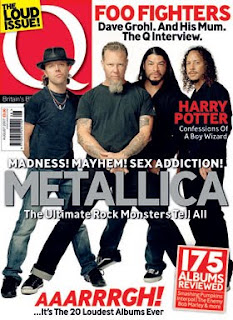 Audience for Q magazine: for this im going to analyse the demographic and the psycographics to help me get the right audience for my magazine.
 - Age- Looking at the dominant image its very professional it looks likea photoshoot purposely and this tells me that this magazine is more professional so the target audience would be older then they would for Kerrang, 20 - 40.
- Gender- The gender for this magazine I would say is equally both sex. I thinkthis because of the colours used in the magazine and its a lot more sophisticated than the Kerrang magazine. It also doesn't create stereotypes like the Kerrang so I feel women would also like this magazine.
- Life style- The life style of the audience for Q magazine I think would be more proffessional in the economic group of D /C2 this is because the magazine seems more professional because of the colours used as they are just basic and make the magazine look less cluttered but at the same time its not plain. Also I think the magazine is more for people who are one the move and have more things to do in their time because the font is very easy to see where as on the Kerrang magazine its more smaller so more attension is needed to read the magazine.
- Interests- There interests would be their work and also their social lifes. Also they will have a interest in music and will enjoy reading about their favourite bands and finding out about gigs. Bu tthis magazine I think will focus more on important information about bands then the gossip of band life and I think that is what the target audience of this magazine will like.
- Education- I think that people who read this magazine will be people who are currently nearly finished at the university and people who have specific careers. I feel the people who read this will have a profession but will still have their passion fr music and interests in music.
- Outlook on life- I think the audiences outlook on life will be to achieve well in live to habve the finer things but don't loose who you, which is why they would want to read the magazine to help them keep up to date with their interets in music.
- Representation- The representation of the dominant image is that these people or this band is "hard". This is signaled by the way they are stood, this connotates that people who read this magazine will look up to these people as if they are legends. Also the "loud issue" connotates that this magazine does various different types of music suggesting that it is for a wider audience connotating that this magazine is for a wider range of audience not just rockers all though rockers can enjoy a read from this. Also the font used and the masthead style is professional as its easy to read and clear to see giving the response to the audience that the magazine is easy to read and professional.
- Genre- The genre of the magazine is rock and pop. I think this because not all the issue have the dominant image of a rock band for example one magazine had the dominant image of "Lady Gaga" so this tells us that this magazine is for a wider range of audience which tells us that the genre is not just rock.
- Layout- The layout of the magazine is very orderly beause every detail on the magazine is seen easily by the audience of the magazine. I t doesn't have too much going on, on the magazine it only shows on image which tells us this issue is focused on that particular band/ artist. The layout it very plain to make sure it looks professional and thought of so its more sophisticated and not childish.


No comments:
Post a Comment