Tuesday 19 October 2010

Research and planning: Analysis of exsisting magazine contents page and two page spread.


Genre: The genre of the contents page is rock. This is signal through the pictures for example the picture that dominants the magazine is connotating the typical rocker, Tattoo's, swearing which connotates rocker attitude. All of the picture represent the stereotypical rocker.
Target Audience: The target audience for this magazine is people who are students or people who have a part time job, social-economic group E/ D. This is because the magazine doesn't really look professional because there is more use of pictures then words connotating that the audience would not understand the magazine properly if there was more paragraphs.
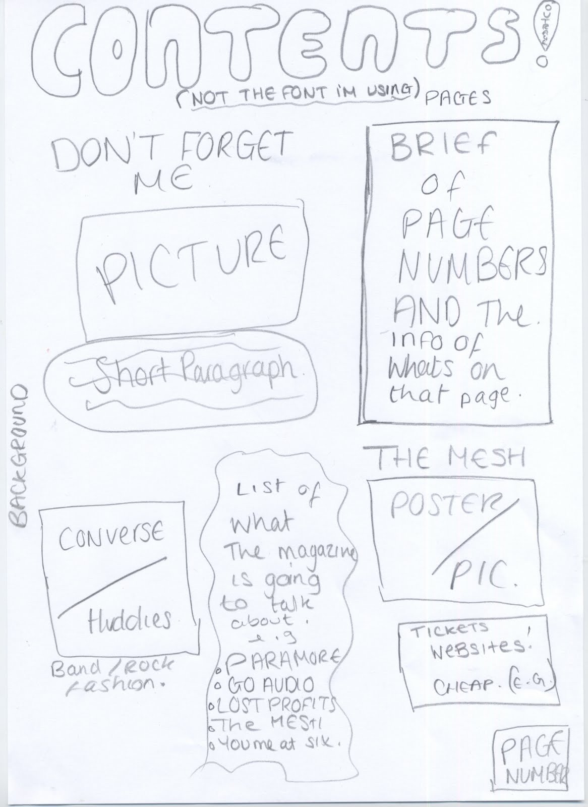
Layout: The layout prioritizes the images on the magazine to makes sure the audience understands what the magazine is going to be about. Also it looks untidy making it look less professional, on the other hand the layout suits the magazine because of the stereotypical rock images of untidiness and attitude its conveyed through the layout used, so the layout relates to the audience.
Representation: The representation is young and and easy going and this is represented through the amount of pictures used. This is because there are loads of pictures signaling that this magazine is aimed at people who just want to be able to easily red the magazine without too much concentration. Also the images show people who seem to look like they don't take life seriously and this is because of the poses and facial expression they use. So this give the connotation that the target audience also share that outlook on life and look up to these people because they like their aspirations and priorities.
Genre: The genre of the two page spread is Rcok. We know this from the band and the pictures showed. The man on the microphone.
Target Audience: The target audience is social group E/D people who are in educatiion from the age of 16 to 25. This is because the two page spread seems easy reading and easy to understand as it only has a short story and it has use of graphics. Making it less profressional.
Layout: The layout of the magazine makes the two page spread less professional because its uses a lot of graphics to tell thestory which means the reader doesn't have to concerntrate too much on reading the article. Also the writing that is in the article is short and doesn't seem to need that much effort to read.
Representation: The representation of the readers from this two page spread is that they enjoy to read this magazine so they don't have to read much and can just flick through the magazine understanding it easily. This associates with the target audience well because they are students and part time workers meaning they don't want to have to concerntrate too much to get the information out of the magzine.

Research and Planning: A contents page draft.

This is a draft of my contents page, these are intial ideas put together, on my contents page im going to ensure that there is a lot of graphics so that my magazine appeals to my target audience. I have used some influence from my analysis of the Kerrang contents page but I feel there should be more information on my contents page so my readers understand the layout of the magazines and the stories on it.

Research and Planning: Potential fonts for my masthead


Here are some potential fonts for my masthead "Outrage" I think all of these fonts resemble and associate with a rock magazine, but the last font (the one in purple) I feel is a really good font but its not clear enough to be a font on a music magazine cover. I think that the masthead in red is the best for a rock magazine because it relates to all ages and connotates the genre rock well. I think the green masthead is a very good rock magazine font but I feel its very childish and will not apply to students at university.

Research and Planning: My first podcast

This is my first ever podcast and I have put some of the finished products of what I did in September and they relate ack to the podcast.

Monday 18 October 2010

Research and planning: A front cover draft

This is a draft of ideas for my front cover. I have used the results from my questionnaire and the analysis of the two magazine front covers, to create something that I think will appeal to my target audience.

  • I have used the analysis of the Kerrang magazine for the smash effect on the Masthead. I feel this will connect to my target audience because from research of other magazines, I found that violence and danger associates with the rock music and the personality of the rockers.
  • I have thought to use the background of the picture because on rock magazines I think its important to show the location of the band because it connotates their life and their music genre.
  • I have put in big writing across the magazine "Don't forget me" because that is a new magazine and thats what this issue is based around for example. Thats why the dominant image will also be of this new band.
  • A barcode would need adding to this to make the magazine more professional.

Research and Planning: Target audience.

This is a description of what I believe my target audience will be.

Age - The age of the target audience I feel would range from 16 to 25.

Gender- The gender of the target audience would be both male and female but more male then female. I think this because of the interests and the stereotypes that the target audience of other rock magazines have
Occupation- I think the target audience would either be students at college or university socio- economic group E. Or somebody with a part time job who can afford to go to the gigs D.

Class- I think the class of my target audience would be working class to students with middle class families. I think this because of the behaviour of people that rock magazines connotate.

Wealth- I think that the target audience if they are students will either have EMA or will have working parents who provide them with money. Or the students that will have loans, unversity students or maybe people who have part time jobs.

Interest- I think the interests will be the gossip of the bands that they are interested in. From my results i have found that a big interest will be gigs and going to gigs. Also reviews and interviews would be another thing they will be interested in. There also going to be interested in college and university, sociolising with friends and going to parties and gigs.

Outlook for future- I think that the out look for the future will be what their studying at their college or university. The target audience who have oart time jobs will probably have the outlook that the life style of rockers could happen to them or maybe thats why they aren't in further education because they want to be rockers when their older.

Monday 11 October 2010

Research and Planning: Ananlysis of two rock magazine front covers.

  • Audience for Kerrang - for this I am going to analyse the demographic and the psycographics to help me get the right audience for my magazine.
    Age- The people in the dominant image look to be about mid twenties, this tells me that they will be role models for people who are into rock/ indie music. I would say the target audience age would 14 to 25, i think this because these people will be able to relate to the magazine judging from the picture.
  • Gender- The magazine is very male dominated as all of the pictures are of males. This tells me that the magazine is for a male audience because a male could look at this and relate to it more than a female could.
  • Life style- The magazine audiences life styles would be students, unemployed and maybe unskilled workers. This is because the magazine doesn't seem to be of an audience of professionals because of the behaviours the images give out and the stories seen on the magazine "sex. drugs. violence."
  • Interests- The interests of the audience would be loud music, violence, danger. They would be interesting in knowing about the lifestyles of the rock bands. They would be interested in all the gossip about the bands.
    Education- From looking at the magazine I think that the education of the readers would either be in education learning e.g College students. Or people who are not in education but are not of a profession so they either have an unskilled job or are unemployed.
  • Out look on life- I think the out look on life for the audience of this magazine would be that to be in the band is there goal in life. Also that violence, drugs, loud music is the way to have a good time.
    Represention: The dominant image on the magazine represents violence and attitude, this is signaled through the chains and bats and also their facial expressions. The facial expressions shows that the people in the image dont care and like what they are doing. The chains, bats and piping they are holding connotate that they are going to damage something. This represents them as out of control.
  • The way they are stood in the main image and the clothes they are wearing represent them as hard as it tells the audience that these people are not scared and to go with them you have to be like them, the outfits.
  • The masthead "Kerrang" is on a background that is smashed this associates with the dominant image and makes it look like they've done it. It also makes the magazine have a dangerous edge to it and connotates a rockers personality
    Genre: The genre of the magazine is rock, this is signaled by the rock artists named on the magazine. Also the stereotype of rockers is violent and the attitude of "don't care." The dominant image connotates this.
  • Layout: The layout of the magazine shows the audience that the band "avenged sevenfold" is the main story of this issue. So this band has a big dominant images to signal this. But on the bottom of the page there are also other bands this shows the audience that there are also other bands and stories in the issue of the magazine. The layout also includes straps at the top of the magazine this is to allow the audience to clearly see what the issue contains. The masthead is at the top of the magazine this is because its where its most likely to be seen by the audience and also because this is where the title is usually.
  • Audience for Q magazine: for this im going to analyse the demographic and the psycographics to help me get the right audience for my magazine.
  • Age- Looking at the dominant image its very professional it looks likea photoshoot purposely and this tells me that this magazine is more professional so the target audience would be older then they would for Kerrang, 20 - 40.
  • Gender- The gender for this magazine I would say is equally both sex. I thinkthis because of the colours used in the magazine and its a lot more sophisticated than the Kerrang magazine. It also doesn't create stereotypes like the Kerrang so I feel women would also like this magazine.
  • Life style- The life style of the audience for Q magazine I think would be more proffessional in the economic group of D /C2 this is because the magazine seems more professional because of the colours used as they are just basic and make the magazine look less cluttered but at the same time its not plain. Also I think the magazine is more for people who are one the move and have more things to do in their time because the font is very easy to see where as on the Kerrang magazine its more smaller so more attension is needed to read the magazine.
  • Interests- There interests would be their work and also their social lifes. Also they will have a interest in music and will enjoy reading about their favourite bands and finding out about gigs. Bu tthis magazine I think will focus more on important information about bands then the gossip of band life and I think that is what the target audience of this magazine will like.
  • Education- I think that people who read this magazine will be people who are currently nearly finished at the university and people who have specific careers. I feel the people who read this will have a profession but will still have their passion fr music and interests in music.
  • Outlook on life- I think the audiences outlook on life will be to achieve well in live to habve the finer things but don't loose who you, which is why they would want to read the magazine to help them keep up to date with their interets in music.
  • Representation- The representation of the dominant image is that these people or this band is "hard". This is signaled by the way they are stood, this connotates that people who read this magazine will look up to these people as if they are legends. Also the "loud issue" connotates that this magazine does various different types of music suggesting that it is for a wider audience connotating that this magazine is for a wider range of audience not just rockers all though rockers can enjoy a read from this. Also the font used and the masthead style is professional as its easy to read and clear to see giving the response to the audience that the magazine is easy to read and professional.
  • Genre- The genre of the magazine is rock and pop. I think this because not all the issue have the dominant image of a rock band for example one magazine had the dominant image of "Lady Gaga" so this tells us that this magazine is for a wider range of audience which tells us that the genre is not just rock.
  • Layout- The layout of the magazine is very orderly beause every detail on the magazine is seen easily by the audience of the magazine. I t doesn't have too much going on, on the magazine it only shows on image which tells us this issue is focused on that particular band/ artist. The layout it very plain to make sure it looks professional and thought of so its more sophisticated and not childish.

Wednesday 6 October 2010

Research and planning: Results from my questionnaire

These are all of my results put together and put into pie charts so I can take the information and use it when I am planning and designing my Indie/ Rock music Magazine.

Tuesday 5 October 2010

research and planning: Audience feed back for music magazine

This is my questionnaire I created to help me structure my own music magazine. I printed 10 copies off and handed them around to let people answer my questionnaire so I could get feed back.

Monday 4 October 2010

Research and Planning: Audience feed back for college magazine.

Audience Feedback for College magazine:
(the bullet points are where somebody has answered my question)

Does my masthead stand out over all the other things included on my front pages?
  • yes the masthead does stand out as its the biggest font size
Do you think the layout of my Front page and contents page is easy to follow?
  • I think the layout on the contests page is easier to follow than the front page as the font page the words are just placed around the photo where as the contents page it is in some sort of order.
Do you think the three colours used connotate a College magazine?
  • Yes the colours do look like they would be on a college magazine
Does the front page and contents look like a typical college magazine?
  • Yes the front page and the contents page look like a college magazine this is because the masthead is a 'college type font' and the pictures are of college students.
looking at the background of the content page and the front page what mood do you think it represents (e.g dull.. etc)
  • The black background make the content and front cover look quite lively as the bright colours of the text stands out off the black background
If you came across this magazine in college would you be tempted to read it?

  • yes
Is my college magazine eye-catching?
  • yes - because of the bright colours
What would you do to improve it?
  • I would make the stories on the front page be presented in a better formation so its not as scattered.