Tuesday, 25 January 2011
Research and Planning: Contents page.
I have included on my contents page a picture of a girls (keisha) looking innocents. i have done this to give a twist to the magaizine, because the people who will read this genre of magazine then they will know she is not innocent. But i have done this so it links with the picture but if you were to look at her eyes there is a slight suspicion. I used the colour red for the box because I didn't want my magazine looking to green and yellow and i also wanted it to attract the readers attention.
Tuesday, 18 January 2011
Research and Planning: Contents page development
I have added extra images onto my contents page, and will also be putting more pictures on but I will be using different models. I put my contents page in this layout because I feel it looks professional but in a rock magazine way.
Research and Planning: Front page development
I have taken on board my feed back and have change the positioning of the "Don't forget Me" so that it is not restricting the view of the band. I want people to be able to see the attitude in there face, so people will pick up the magazine and want to read it because the people n the front have the "I own this" expression.
Monday, 17 January 2011
Thursday, 13 January 2011
Wednesday, 12 January 2011
Tuesday, 11 January 2011
Research and Planning: Chosen pictures for front page and contents
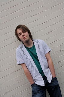
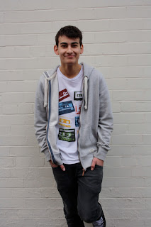
I have decided to use these pictures because of the quality of them and the angles and shots I have got. I also get the representations I want from these photos.
research and planning: Test shots for Front page and Two page spread pictures.
 This picture I did not use because it was too blur,, and I felt I could achieve a better quailty picture. Althought this is the shot type and angle I want for my front page.
These photos were out of focus and I felt I could achieve a canted shot so I took the shots over and over again untill I took the right photo.
This medium to close-up picture is not being used because I felt the facial image did not portray attitude of a rock star and I want the audience to be able to connotate from the picturew that my magzine is rock.
Although i might use this on my contents page.
Subscribe to:
Comments (Atom)


